Layers
Every layer type the Compositor scene can hold and how each one behaves.
A scene is an ordered stack of layers. Lower in the panel renders on top of higher; reordering changes what overlaps what. The Compositor supports twelve layer types — some you draw with tools, some come from connected nodes, some you add through the Add layer menu.
Common properties
Every layer carries the same baseline metadata, regardless of type:
- Visibility — toggle the layer on or off without deleting it.
- Lock — prevents selection and editing until you unlock.
- Name — double-click in the layer panel to rename. The default name reflects the layer type.
- Opacity —
0–100%. - Blend mode — how this layer combines with the layers below it. See Properties → Appearance.
- Transform — position, rotation, scale, anchor. See Properties → Transform.
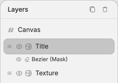
- Mask — optional alpha or luminance mask. See Properties → Layer mask.
The rest of this page covers what's specific to each type, grouped into three families.
Organizing layers
Use the Layers panel to structure complex scenes, not just to reorder them.
Groups and parenting
Groups parent layers together so you can move, scale, rotate, hide, lock, fade, duplicate, or delete a set of layers as one unit while keeping every child editable.
- Select one or more sibling layers and click Group, or press
Cmd+G/Ctrl+G. - Select a group and click Ungroup, or press
Cmd+Shift+G/Ctrl+Shift+G. - Drag a layer onto the middle of a group row to parent it into that group.
- Drag a layer above or below another row to place it as that row's sibling.
Groups can be nested. The Layers panel indents children under their parent group and lets you collapse or expand each group row. A group's visibility, lock state, opacity, blend mode, and transform cascade to its children.
Grouping requires all selected layers to share the same parent. If the selected layers live in different groups, move them into the same parent first, then group them.
Split an image into editable layers
Split into layers separates a single image layer into editable cutout layers. Select one image layer, then click Split into layers in the Layers panel. The dialog asks for:
- Prompt — what objects or regions to separate.
- Layers — how many cutout layers to create.
When the split finishes, the original image is replaced by a selected group containing the separated image layers. Each cutout is a normal image layer, so you can move, hide, mask, transform, reorder, or split it again independently.
If the source image came from a connected input, splitting turns it into editable scene layers. Later upstream changes will not overwrite that split group.
Layer types
Layers you create with a tool.
Rectangle
Drawn with the Rectangle tool. Type-specific properties:
- Width / Height — pixel dimensions.
- Fill — color, on/off.
- Stroke — color, width, position (
Center/Inside/Outside), on/off. - Corner radius — uniform across all four corners.
Good for backgrounds, framing devices, callout chips, and as a base for masks.
Ellipse
Drawn with the Ellipse tool. Same fill/stroke as Rectangle, no corner radius.
Vector
Drawn with the Pen tool. A vector layer is one or more subpaths, each of which is a chain of points (anchors) with optional control handles (the lines that pull out from a point and shape the curve into and out of it).
If you've used Figma's pen tool, the four point types map cleanly onto its vocabulary:
- Corner — no curve smoothing; handles move independently. (Figma: No mirroring.)
- Smooth — handles mirror in both angle and length, so the curve flows symmetrically through the point. (Figma: Mirror angle and length.)
- Asymmetric — handles share angle but the lengths are independent, so each side of the curve can have a different "weight". (Figma: Mirror angle.)
- Auto — Fuser computes the handles for you from the neighboring points using Catmull-Rom interpolation. Useful when you just want a smooth curve through a series of clicks without fiddling with handles. (No direct Figma equivalent.)
Fill and Stroke behave like Rectangle.
Raster
The output of the Brush tool — a pixel surface you paint into. The brush creates a raster layer if none is selected; otherwise it paints onto the selected one.
Behind the scenes, your painted pixels are saved to your project's media library and the scene records a reference. See Concepts → Raster persistence.
Eraser mask
When you erase on a non-raster layer, the Compositor creates an eraser mask layer linked to the parent. The mask hides parts of the parent without modifying its content; deleting the mask restores the parent in full.
This is the non-destructive form of erasing. To erase pixels permanently, use the Eraser on a Raster layer instead.
Layers that hold media — typography, images, video, and color.
Text
Created with the Text tool. Text layers are rich — they're more than a font and a color.
Typography:
- Font family — choose from built-in fonts, Google Fonts, or custom uploaded fonts.
- Font size —
1–10000px. - Color — any hex.
- Letter spacing — em-relative,
-20to100. - Line height — multiplier,
0.5–3(default1.2). - Alignment — left, center, right, justify.
Custom fonts. Select a text layer, open Typography, then click Upload next to Font. Supported font files are .ttf, .otf, .woff, and .woff2. Fuser asks you to confirm that you have the right to use the font before loading it.
Custom fonts stay local to the current device. If you open the composition on another device and a text layer uses a missing custom font, the layer shows a warning and offers Upload font file so you can provide the matching font there too.
Variable fonts. When the chosen font supports variable axes (commonly weight, width, optical size), the panel surfaces a slider per axis. Each axis can be animated by connecting a number node to the corresponding socket on the Compositor — useful for breathing weight or width morphs.
Manual kerning. You can adjust per-character kerning for fine control over letterforms.
Sizing modes — text boxes behave like Figma's:
- Auto-width — the box is one line tall and grows horizontally as you type.
\nforces a break. - Auto-height — the box has a fixed
maxWidthand grows vertically as text wraps. - Fixed — both width and height are pinned. Text overflows if it doesn't fit.
Stroke. Optional outline around the glyphs, with color, width, and position (Center / Inside / Outside).
Text uses an origin anchor
Unlike most layers, text rotates and scales from its top-left corner, not its center. See Concepts → Anchor points — and override the anchor in Properties → Transform if you want it to behave like a shape.
Image
Comes from a connected Image node, a paste, or a drag-drop. Type-specific properties:
- Source dimensions — the original pixel size of the image.
- Display dimensions — the size of the layer in the scene; setting these doesn't resample the source.
- Crop — adjust visible bounds without scaling the source.
Images are referenced by URL; replacing the upstream input swaps the URL but keeps the layer's transform.
Video
Comes from a connected Video node, a paste, or a drag-drop. Same source/display dimensions and crop as Image, plus:
- Loop — per-layer toggle.
- Playback — controlled from the Timeline when the scene has video layers or duration.
Multiple video layers play in sync against the scene's clock; the longest determines the effective duration unless you override it in the Canvas section.
Solid color
A flat color fill with explicit width and height. Useful as a background layer, a quick color block for a mask, or as a tinted overlay paired with a blend mode.
Add via the Add layer menu in the layers panel.
Niche layer types — 3D objects, non-destructive effects, and nested compositions.
3D mesh
Rotatable, scalable 3D objects rendered into the scene. Created from the Add layer menu (built-in primitives) or by connecting a Mesh node (custom .glb / .gltf).
- Mesh — built-in (
bunny,cube, …) or a custom URL. - Viewport size — width and height,
64–2048px each. - Rotation — independent X, Y, Z (
−180°to+180°). - Scale — uniform across all axes.
- Material —
metallicandroughness, both0–1. - Color tint — applied multiplicatively to the material.
- Gizmo — switch between rotate and scale handles for direct manipulation on the canvas.
Adjustment
A non-destructive layer that affects the layers beneath it. You stack one or more filters on it; each filter has its own intensity slider.
Basic adjustments (8) — Blur, Brightness, Contrast, Saturation, Temperature, Tint, Sepia, Grayscale. Each accepts a value or intensity in its own range.
Preset filters (8) — Vintage, Kodak Film, Polaroid, Film Noir, Fade, Cross Process, Vibrant, Muted. Each is a curated Instagram-style look with a single intensity slider (0–100%).
Filters apply in stack order. Reordering filters within the layer (and reordering the adjustment layer itself) changes the result. Add via the Add layer menu and pick filters from the dropdown.
Compositor (nested)
Reference another Compositor's output as a layer in this scene. Connect a Compositor node to a Compositor input, and the Compositor layer appears in your stack.
The reference is live, not a snapshot — when the upstream Compositor changes, the nested layer reflects the change. Useful for reusable scene fragments (a logo lockup, a recurring frame, a shared color palette) shared across multiple compositions.
The first input sets the canvas
The first input you connect to a Compositor (image, video, mesh, or another compositor) determines the canvas dimensions. Disconnecting and connecting a different one doesn't resize the canvas — that's by design. Resize manually from Properties → Canvas if you want different dimensions.
Keyboard navigation
The Layers panel responds to keyboard input on the focused layer row:
EnterorSpace— select the layer (same as clicking it).Tab— move focus through layer rows in DOM order.
Move between layers up and down the stack by clicking, or by selecting the corresponding layer on the canvas with the Select tool.